Colours are always associated with different emotions and moods. Many factors influence people and what makes them prefer one brand over another. Yes, subjectivity certainly plays an important role, but there is more: every company must consider not only personal preferences, but also and above all the different cultures of the customers they want to target, establishing an authentic connection with them.
Colours are perceived differently according to experiences, stories, personal tastes, context and culture. A colour that is seen positively in one culture may remind something negative in another.
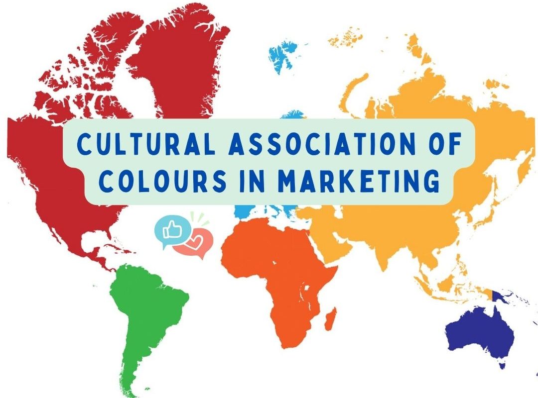
Culture influences people’s colour preferences and therefore plays an important role in the choice of colours in marketing actions. Companies should therefore not only consider what ‘fits’ with the brand identity but also the impact colours have on the target audience and their culture.

BLUE
In Western cultures, blue is associated with values such as stability and trust and is therefore commonly used by companies such as banks and insurance companies.
In Hinduism, blue is linked to Krishna, an important deity of compassion, love and tenderness.
In China blue is a purely feminine colour – as opposed to Western culture where blue is more associated with the male gender – and is linked to trust, longevity and quality. However, it is not an important and heartfelt colour in this culture, so it is better to use popular alternatives such as red and yellow to address the Chinese audience.
In Eastern cultures, blue is reminiscent of spirituality and in Latin America, where Catholicism is often strongly felt, blue is associated with religion as the colour of the Virgin Mary’s mantle.
Despite its ‘sad’ connotation, blue is the most favourite colour worldwide. Not surprisingly, it is one of the most widely used colours in marketing to create a relationship of trust between brand and costumer.
RED
Red is a happy and lucky colour in China and is often used for celebrations (think of the Chinese New Year). In Western society it has both positive connotations (colour of passion and love) and negative (aggressive colour, reminiscent of blood and danger). In India, red is worn by brides on their wedding day as it is auspicious and a pure colour.
McDonald’s is one of those companies that adapts the use of colour according to the market. The fast-food restaurant chain uses the colours yellow and red as they are appreciated by children and stimulate the appetite. But what makes this company one of the smartest in marketing is its customisation of websites according to the country. In India red is therefore used prominently, while in Europe, for example in Switzerland, the company has made red an accent colour and decided to focus on yellow, a less aggressive but still stimulating colour.


YELLOW
Yellow is considered the happiest and most creative colour in the western cultures. In some African countries, yellow is reserved for people of high society, as it is the imperial colour and is linked to money.
In Chinese culture, yellow is very important as it is associated with wealth and authority, as well as being the colour of the emperor in Imperial China. For companies operating in the aforementioned areas, yellow is the ideal colour!
However, companies must bear in mind that in other cultures and areas such as Egypt and much of Latin America, yellow symbolises death and mourning, while in Germany it is associated with envy. It is therefore better in these cases to opt for a more appreciated colour, which can give value to the company and its marketing campaigns.
ORANGE
In Japan, orange symbolises vitality and happiness (just like in Western culture) as well as courage, beauty and nobility. In Eastern cultures it is linked to good health, and in the United States it is associated with Halloween and Thanksgiving. Companies can use orange to show their friendly brand and to appeal to a call-to-action.
In India, orange, especially in its saffron hue, is sacred.
However, in the Middle East, orange is associated with mourning, and should therefore be avoided!
GREEN
Green is a very important and sacred colour for Islam as it is reminiscent of Paradise. Green is the national colour of Mexico, symbolising patriotism and independence. In many South American cultures, green is associated with death. In Japan, green symbolises eternal life. In Western countries, green is linked to nature, good luck, health, growth, but can also have negative connotations such as jealousy.
In China, green can also indicate misfortune and infidelity, so much so that wearing a green hat in China means cheating on your spouse.
Companies use green a lot when associated with environmental and medical topics, but also relax and well-being. It is always useful to remember, however, that a certain colour may be appreciated in some cultures and countries of the world and less so in others.
PINK
In Western cultures, pink is associated with femininity and is linked to values such as sweetness, childhood, delicacy and is widely used by brands targeting a female audience. In Chinese culture, pink is seen as a shade of red and is therefore a fairly appreciated colour.
In general, using pink in a brand and its products / services is a good idea, as it is a stimulating and calming colour.
PURPLE
In Europe and the Middle East, purple is considered the colour of royalty and wisdom. In the United States it is the colour of honour: the Purple Heart is the oldest military award given to the American Army. Purple is therefore widely used by brands that want to communicate a sense of wealth and luxury, but also by brands that want to differentiate themselves from the competition as it is not such a common colour.
In Chinese culture, purple is associated with luxury as well but also with love, attracting young people; hence, purple is used to address them.
In some Latin American countries (such as Brazil) and Thailand, purple indicates death and is worn during mourning, so brands have to pay attention to the use of this colour in these cases!
WHITE
The most amazing thing is how this ‘neutral’ colour can be interpreted in completely different ways. If in Western countries and in Africa white is seen as the colour of purity and innocence, in many Asian cultures it is associated with death and mourning.
Here more than ever, companies need to pay attention to their target audience. Apart from when white is used as an accent colour, in cases where the brand decides to use it as the main colour, it must be careful to consider the two opposite meanings.
BLACK
The same principle of white is followed by black, a colour considered positive in countries such as China, where boys wear it because of the meaning of youth and energy it confers, and Japan, where black is popular among girls as it denotes mystery and femininity. In some African cultures, black is a symbol of maturity and masculinity.
In India, Thailand, America and in many cultures around the world, black is associated with evil and death. On the other hand, however, black evokes sophistication, luxury and elegance and is therefore widely used by luxury brands.
Culture strongly influences the way colours are perceived, so one must always remember to consider this fundamental aspect when addressing customers and not to assume that one’s opinion on something is shared worldwide.

Check my previous posts here: