Well begun is half done. Isn’t it?
Choosing the right colour in the brand creation phase is essential to influencing future customers and establishing the first relationships with them. Relationships that result in emotions that the costumer unconsciously feels, thanks to the evocative power of colours. After all, you don’t sell products, you sell experiences.
Let’s get to know some of the brands that chose the perfect colour for their vision.
BLUE: FACEBOOK
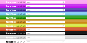
Facebook, with its 2.9 billion members, is undoubtedly the king of social networks.
But have you ever wondered what was behind the choice of colour? Mark Zuckerberg said his colour blindness influenced the choice of blue, as it is the colour he sees best compared to others. But this is only part of the meaning behind it: the answer lies in how people react to colours.
Blue is the most popular colour used by companies when it comes to conveying trust and credibility. The colour itself has a relaxing effect and gives a sense of stability, which in the case of Facebook translates into staying longer on the social network to visit friends’ profiles, comment on posts and click on links. Of course, all these activities allow Facebook to show you more ads and thus increase impressions.
RED: KINDER

In the first post I mentioned how red has a certain influence on the nervous system, in particular how it stimulates the appetite. Not only fast food, but also Kinder has seen fit to use red to catch the customers’ attention and to make them hungry. I don’t know about you, but it works for me!
White accompanies each product and is an absolutely excellent choice, since it recalls milk and makes the product itself not aggressive.
The website is also dominated by a warm red, but also by light blue and white, which however remain in the background.
YELLOW: NIKON

I believe Nikon has found the perfect colour for its brand. Why? If you read the first post, you should know yellow is a happy colour that stimulates creativity. The company’s corporate philosophy is precisely “Trustworthiness and Creativity”, for which the company offers quality technological products, which aim to be recognized and trusted by consumers around the world.
Moreover, their vision of “Unlock the future with the power of light” can be most easily represented by the colour that most resembles light. In the logo, yellow represents the passion for progress, while black is related to the quality and reliability of the brand.
ORANGE: AMAZON

Could I not dedicate the section on orange to a giant like Amazon?
Born in 2000, the Amazon logo symbolises the technological progress and features the word ‘AMAZON’ with the famous orange arrow underneath, connecting A to Z. Is it a coincidence that the arrow forming a friendly smile is in orange? Of course not. As mentioned in the first post, orange evokes feelings of happiness and energy, therefore it’s perfect to convey positive company values.
In addition, the orange invites a call-to-action, and not surprisingly many of the buttons on the Amazon website are in that colour.
GREEN: STARBUCKS
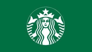
Green reflects the environment and mother nature in all its facets. At the same time, it is a colour that recalls youth and the pleasure of enjoying life. Who do you think managed to combine these two different aspects? Starbucks, of course!
Consumers perceive the brand in the way it wants to be perceived: green is often associated with positivity and social responsibility, and this is how we unconsciously perceive it.
The siren of the brand’s logo and cups is young and smiling. The green represents the multinational’s responsibility towards the environment, as well as the care for farmers and fair trade coffee products.
PINK: VICTORIA’S SECRET
 If you think of the American lingerie and clothing brand Victoria’s Secret, the association with pink comes naturally. As an all-female brand, pink fully represents values such as love and femininity, with a pinch of sensuality. Guess what: they also have a product line called “PINK”.
Pink in all its nuances takes centre stage on the website. The colour is present not only in most of the garments worn by the models, but also to communicate prices and discounts. Even the iconic striped shopping bags confirm the symbolic feature of pink for the brand.
PURPLE: KIKO
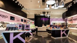
Several make-up brands focus on purple as a strategy to appeal to the female audience. As an example, there is the Italian cosmetics company Kiko. Among the most popular colours for women are purple and black, both of which feature in the Kiko logo and stores.
Black represents elegance, sobriety and classicism. Purple also represents elegance but also beauty, and is perfect for a brand that wants to combine the importance of femininity with the quality of the products.
WHITE: VICHY
 Vichy is a French cosmetics brand which produces therapeutic cosmetics based on thermal water.
What colour could be more suitable than white to represent the brand’s concept of purity?
Combining products that have to do with skin care and beauty with white is certainly an excellent choice: the customer will associate the purity of white with the benefits of cosmetics, like maintaining a young and healthy skin.
BLACK: CHANEL

The colour of luxury par excellence, black never tires. Coco Chanel, the businesswoman known all over the world for her timeless designs, made it even more exclusive and glamorous.
The iconic Chanel logo consists of two mirrored and intertwined Cs that inspire elegance and wealth, to which the simple yet impactful wording ‘CHANEL’ is added below. Although there is also a version with white lettering on a black background, the powerful logo is most often depicted in black on a white background. As well as its products, black is also the star of the logo, to which it gives a touch of sophistication and power, also found inside Chanel stores.
Read my previous article about psychology of colours in marketing here.


Very interesting to know why certain brands choose that particular colour and how it actually affects all of us.
Thanks again! 🙂
Hi! Thank you, I really appreciate that 🙂
Very interesting post! It’s perfect for people like me who know very little about marketing
Well done!
Thank you Marianna 🙂 yes!! it’s one of the reasons why I write this type of content