When you buy any product and focus on the colour that identifies it, you have no idea on what’s behind it.
We tend to think that the choice of colour is random or a matter of personal taste. This is not the case.
Colour is one of the elements a company defines in the creation of its brand identity, intended to arouse specific emotions that are consistent with the company’s goals.
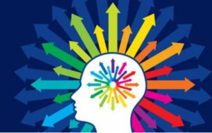
Thanks to its “power”, the psychology of colours in marketing is often considered as a real science able to influence the choice of a product and the consequent brand loyalty.
At least once in your life, you will certainly have had to choose a product without knowing the brands on offer: why did you choose a certain pack rather than another in that situation? Among the various factors, the graphic and its colour were the elements that most influenced the choice; in fact, colours stimulate certain parts of the brain and, depending on the type of product we are willing to buy, we are more or less attracted to a certain type of colour. For example, would you ever buy an intimate cleanser with red packaging? You might think there’s nothing wrong with it, but if you were in the position of choosing between different products, the first one you would discard would be the red one, because you would subconsciously consider it too strong and aggressive for an intimate cleanser. In this sense, something like white, pink or teal would be perfect because they are lighter and therefore more suitable to represent delicacy, purity and cleanliness.
The correlation between colours and emotions is significant in itself, and even more so in the product-consumer relationship. The consumer unconsciously associates a colour with an emotion, which obviously depends on the context in which the colour acts: returning to the red theme, it would be ideal if associated with a fast food chain. Why? Don’t worry, I’ll get there soon.
Colours are always – or at least should always be – conceived as key elements to reinforce the brand identity and differentiate from competitors, given their influence on consumer perceptions.
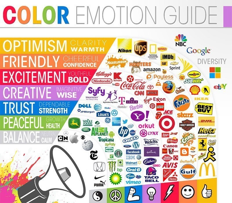
As already mentioned, different colours stimulate different emotions and convey different messages. To facilitate the task, it can be useful to distinguish between cold colours (blue, purple…) and warm colours (yellow, orange…). The former unconsciously arouse feelings of trust in the brand, while the latter, being energetic and passionate, attract and involve the customer. Let’s see in detail what advantages and disadvantages the psychology of colours in marketing brings.
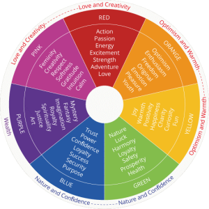
BLUE
Blue is a colour that refers to the concept of tranquillity and reflection. It is a very formal colour, which reduces stress and communicates harmony, confidence, reliability; it is no coincidence that it is the most popular choice for customer-facing companies. Thanks to its reassuring effect, it is very often used in the logos of banks (Credit Suisse, to name but one), insurance companies (Allianz), consulting firms (KPMG), as well as in the logos of certain political parties. Of course, social media joins the list: did you know that blue is addictive? If Facebook, Twitter and Skype have been using it, it is no doubt because blue encourages the user to stay longer on social media.
But beware of considering it perfect: blue can also appear aloof and uninvolving, and even be considered a sad colour: it is no coincidence that sometimes you feel “blue”.
Another aspect to consider when choosing the colour of the logo is the brand differentiation. In this case, blue is among the most used colours ever by different companies, therefore I would recommend combining it with another colour to get a unique logo.
RED
At the opposite end of the spectrum to blue is red, a warm, energetic and passionate colour par excellence. In marketing it is used to attract attention, as in the case of promotions, where immediate action is required and the lettering is enhanced by the warm colour.
It is the winning colour in the restaurant business for impulse actions: did you know that it stimulates the appetite? So is it a coincidence that McDonald’s, Burger King, KFC, Domino’s Pizza have red in their famous logos? Now imagine the logos of the chains mentioned in blue or beige: would we be tempted in the same way? Of course not. The last two colours are actually the ones that make you lose your appetite. Absurd, isn’t it?
But beware: the immediate impact that red offers is not always beneficial. Just as it is a symbol of love, it can also be associated with anger and aggression, danger and violence: it should therefore be used with discretion. It would be unthinkable in a financial context, for example, considering that clients, or rather their unconscious, would perceive danger.
YELLOW
Did you know that happy people tend to prefer yellow to other colours? This is because yellow conveys joy, stimulates energy and increases creativity. In some ways it resembles the attributes of red, while leaving out the negative aspects. In fact, yellow is considered the colour of optimism (think of the famous Smiley) and is often associated with the world of childhood, being widely used by children in their drawings. In marketing it is combined with black or grey to communicate seriousness (e.g. Ernst & Young) and to catch the consumer’s attention; it is no coincidence that this combination is widely used in road signs.
Together with red, it stimulates hunger and is therefore often used in restaurants and fast foods.
However, the best association is with the sun, which is perfect for communicating the concept of energy: Eni and Shell demonstrate this perfectly.
However, attention must be paid to the message of cheapness that yellow can convey. There are therefore cases where it is better to use alternatives if you don’t want to make your product or service look cheap.
ORANGE
Halfway between red and yellow is orange, which is in fact a kind of synthesis of the two. Orange is also a colour that conveys positivity and energy, attracts attention and gives free rein to creativity and play if linked to the world of childhood; an example is the children’s channel Nickelodeon. Orange is dynamic, energetic, fun; it is perfect for engaging a young audience and communicating in a friendly way with them. It also gives a sense of adventure, which is why it was chosen as one of the main colours of the American motorcycle manufacturer Harley Davidson.
Orange is the star of Amazon’s famous logo, colouring the smile arrow connecting A to Z, indicating that you can find everything from A to Z on Amazon!
As with any colour in marketing, it has its downsides: it can tire the eye and would be better associated with another, calmer colour (blue for example); it is also not the most suitable colour if you want to send a serious message.
GREEN
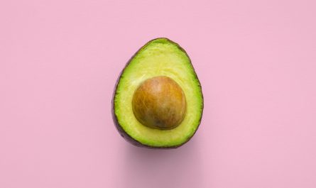
Green is the colour of hope and rebirth, it is reassuring and therefore helps to relax the nervous system; it is used in the context of well-being, health and the environment. It is also undoubtedly the colour of nature: Land Rovers, for example, use green to show that they are made for nature. Nature is also linked to ecology, sustainability and organic products; the latter, together with vegan products, are most often represented by green in catering. It is also used by banking and insurance institutions – after all, green is also the colour of money -. Among its many meanings is that of freshness, which is why green is used in cleaning products (it resembles the colour of mint in toothpastes) and hygiene products (it resembles the colour of aloe vera in intimate cleansers).
The light green is linked to values like growth and vitality, while the dark one indicates wealth, trust and maturity.
PINK
Pink is the colour most associated with the female universe, as it is delicate and relaxing. It is associated with grace, romantic love and femininity, especially in its pastel shades; it is the colour of the bow that symbolises women’s fight against breast cancer. Fuchsia is mainly used to evoke optimism and serenity, and is often used as the main colour for girl’s brands (the timeless Barbie logo).
PURPLE
Violet is the result of the combination of two completely different colours – vigorous red and reflective blue – and is therefore a very special colour, full of meaning. It represents wisdom, magic and beauty. It is also the colour of nobility and wealth, so it can be combined with luxury products and services because it is very elegant; for women it communicates sensuality and femininity. It is not common in logos, so you can use it to differentiate your brand from the competition. Purple can be found in beauty companies such as perfumeries (Marionnaud), but also in finance, marketing and web companies (Yahoo! and Twitch).
WHITE
Symbol of purity, spirituality, refinement, simplicity. It is the colour, or rather the non-colour, which better than any other can effectively represent themes such as cleanliness and hygiene in the health sector (Pantene), but also elegance and minimalism in the field of design (Apple). It is certainly not a colour that indicates personality, so it is advisable to use it only if the brand is linked to the characteristics just mentioned.
BLACK
Elegant, sober, sophisticated: black is undoubtedly the colour that best suits the fashion industry, and in particular luxury, design and everything that can communicate power and exclusivity. Luis Vuitton, Prada, Cartier have made black their trademark, often adding softer colours such as white, silver or gold that can make the brand even more luxurious and professional.
Black is also a great colour for companies that want to communicate their brand identity to young people, characterised by being cool and alternative (I am thinking of Nike and Adidas).
Again, you should always consider the negative aspects such as darkness and death, so the ideal colour should always represent the idea behind the business.
Stay tuned for more on the importance of colours in marketing with my upcoming posts!


Articolo curioso,
Aiuta a capire ciò che inconsapevolmente facevamo già.
Grazie Anita
Esatto, è incredibile come lavora il nostro cervello. Nei prossimi post trattero’ l’argomento ancora piu in dettaglio 🙂 Grazie mille per il commento!
Interesting and engaging, it’s a great article!
As a marketing lover, i will certainly follow your next posts!
Thank you ?
Hey Sara thank you a lot for your comment, I’m so happy you’ll read my next posts 🙂