The success of a website is influenced by many factors. Among these, colours play a key role: if used in a smart way, they can make the user navigation smoother and more pleasant, and they can let the visitor stay longer – and even make actions – on the website by holding his/her attention.
Since the goal for companies is to improve conversions, colours are definitely the right ally to influence users’ emotions and make them register on the website, subscribe to the newsletter, purchase a certain product, and so on.
Of course, colours represent the brand and the message it wants to convey, so there must be consistency on the website as well. Colour psychology is used in web design to influence people’s behaviour and emotions, thanks to the influence colours have on the human brain.
In choosing the right colours for the website, it is important to consider both the industry in which the company works (for example red for food companies) and the preferences of the target audience.
The essential elements to pay attention to are background, images, headlines and CTA buttons. Just as in newsletters, websites should also follow the 60:30:10 rule: 60% main colour, 30% secondary colour and 10% accent colour.
An aspect that is often implied but sometimes little considered is the readability of the website. Especially for the CTA buttons, it is important that they stand out and that the user does not struggle in understanding what is written there. There should therefore be a high contrast between the text and the background.
Let’s see in detail how colours work in websites!
BLUE
It is associated with trust, safety and dependability, and is therefore very popular in corporations such as banks and insurances. On a website, blue leads users to relax and subconsciously trust the site. Remember that there is also the ‘sad’ side of this colour that needs to be taken into account. In the example below, you can see that the company, which provides financial advice, uses blue to convey reliability and credibility.

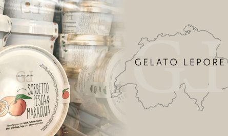
RED
It is THE attention-grabbing colour that symbolises strength, energy and passion.
On websites it is frequently used for CTA buttons and in general to push visitors to take impulsive actions. Being an aggressive colour it should be moderated on websites as well.
In the example, red is present but not aggressive at all. It is the ideal colour in this case as it is placed in a food context.
YELLOW
It is defined as the colour of happiness and warmth. Yellow is the perfect colour if you want your website to be welcoming and energising. That’s why it is commonly used by websites that offer products and services for kids. It is also often found on the websites of travel agencies. Remember that yellow also has a connotation of cheapness and should therefore be dosed.
The example shows what has been said before: this websites looks cool and fun, the perfect design to represent a camp for kids.

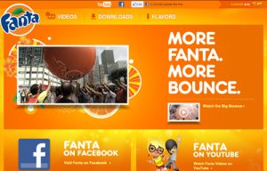
ORANGE
It is the midpoint between red and yellow, as it combines the eye-catching feature of red with the energy and enthusiasm of yellow. On websites orange can be used to draw users’ attention and make them want to subscribe or buy something.
You can find orange in websites that deal with creativity, fun, excitement, and is therefore used in e-commerce, entertainment and food companies. Being a strong color that can be overpowering, it should not be used too much.
On the Fanta’s website, orange comes from the colour of the logo, which in turn comes from the orange fruit. It’s the perfect colour to represent both the drink and the fun that has always been associated with the brand.
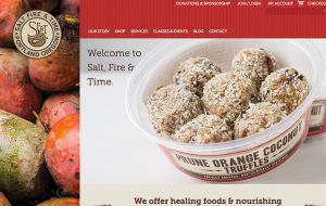
GREEN
It is basically the colour of nature. In addition to its correlation with it, green reminds people of growth, health, harmony and good luck.
Green can therefore be used in websites to give readers a calming and relaxing effect, and it also represents growth and stability. It is often used on websites dealing with science, medicine and the environment. However, it is not the best option for luxury products.
Since the website in the example is about nature, the main colour chosen was green, which appears as the predominant background.

PINK
In Western culture it is mainly used as a colour for a female audience, reminiscent of delicacy and romance. It is in fact mainly used on websites whose products and services are dedicated to women and girls. This is confirmed on the website of the jewellery company Oui by Jean Dousset.

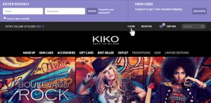
PURPLE
It is the colour of royalty and luxury. It is used on websites to communicate authority, power, mystery, wealth, elegance and wisdom.
In addition to luxury websites, purple is also featured in make-up and beauty companies, as you can see in this example from the cosmetics brand Kiko.
WHITE
In Western culture, white communicates purity, innocence, cleanliness, hygiene and is therefore often used by healthcare industries. It works for luxury brand websites when combined with colours such as silver, gold and black. Of course, the effect of the design depends on the other colours that are matched.
This website aims to find the perfect health insurance and white was chosen to represent the health care and therefore important values such as hygiene and cleanliness.

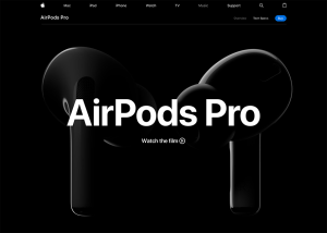
BLACK
It is the colour of elegance, glamour and sophistication, and is therefore a very popular choice for luxury, fashion and marketing brands.
On websites, black is used to emphasise the contrast with the other colours and to highlight the brand.
As the other meaning of black is death and darkness, it’s always better not to overdo it.
This example shows how Apple promotes its AirPods Pro with a very sleek and minimalistic black website. Am I wrong or is the idea of luxury evident here?
Check my previous posts here:

![Bronze doit of the Dutch East India Company (VOC), depicting its date of production and the Company's monogram logo. The VOC's logo was possibly in fact the first globally recognized corporate logo.[1]](https://blog.hslu.ch/majorobm/files/2019/03/Münze_Niederländische_Ostindien_Companie-320x265.jpg)