
When preparing an email, we tend to focus a lot on the text, often neglecting the importance of good visual elements, which are basically what captures the reader’s attention once the email is opened. Among these visual elements, colour is the most significant attribute, which can make your email very interesting or, on the contrary, ruin it due to poorly thought out colours or colours that do not work together.
The first thing to consider when choosing colours is brand association: even in the context of newsletters, it is always a great idea to use company’s symbolic colours, that can be found for example in the logo. This way, readers associate the mail with the brand and the brand identity is reinforced.
The association with the context in which the company works is equally important: for example, if the email is from a bank it would be better to use a colour that inspires confidence and calm, such as blue or green. Let’s assume that the email is in red: your first thought would probably be “what’s gone wrong?”. That’s because red in a context like the financial one gives a sense of danger, so better avoid it!
 Nothing in an email affects readers’ subconscious like the colour scheme. Colours are the business card of a company that wants to communicate a certain message, as they influence the purchase decision and increase the brand awareness. After all, your product / service may be the best on the market, but with the wrong colour it could fail miserably. Therefore, it is essential to be creative and different from what the competition offers.
Keeping in mind the colours that your company will benefit from, you need to know how to integrate them in order to achieve a harmonious and not chaotic email. The aim is always to make your email readable and easy to remember. For example, bright colours such as yellow and orange would look great together, as would cool colours such as blue and purple.
Here are some useful tips to make your email attractive:
– Shoot the main colours of your company for brand recognition
– Use colours that are easy to read and not too aggressive
– Use a specific colour for each purpose. For example: if you want a call-to-action use orange, if you want readers to spend as much time as possible reading the email use blue
– Do not overdo it! Having too many colours in your palette will make your email a mess: three is the maximum number of colours an email should have
– Create a visual hierarchy following the 60:30:10 rule: decide what is the main colour of your email (60%), what the complementary (30%) and what the accent colour (10%)
– Colours are always subjective: consider costumers’ preferences

Let’s now take a closer look at the benefits of each colour in email marketing!
BLUE
It makes your email credible and relaxing, inspires feelings of trust and reliability. It is the perfect colour if the email comes from a high-tech company, and the last one to use if you are a food company, because it does not stimulate the appetite.
Blue is the most popular colour for men and women so it can often be ideal!
Look for example at this email from JetBlue: the company chose blue as its symbol colour and is reusing it to celebrate its anniversary.
RED
It is a very strong and passionate colour. Using it as the dominant colour in emails is a risky choice because it can be too aggressive so it’s better to combine it with a neutral one. For CTA buttons it is the perfect colour as it stimulates people to make impulsive actions (Buy now and Click here buttons) as well as highlighting important parts of an email.
See how Mac dyed his Mother’s Day email red to encourage people to read it and, above all, to remember the intensity of the colour of the lipstick.

YELLOW
It is the ideal colour to energise your email and to create a joyful atmosphere. Better not to use it if you want to sponsor luxury products and services.
In this email, Calzedonia wanted to call back to summer and advertise its bikinis through the “brightest colour” of the collection.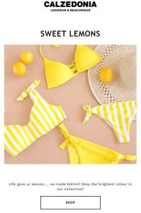
ORANGE
Like red, it attracts attention and drives action. It is in fact widely used to encourage the reader to sign up or click on a link as an alternative to red.
Kate Spade New York’s email, sent to those added to the mailing list, is tinged with orange to give positive feelings and push customers to action.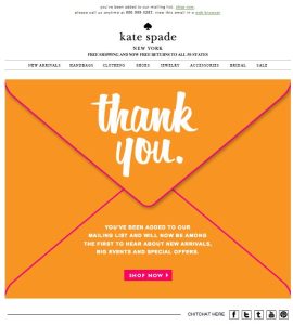
GREEN
Colour of nature, health, life par excellence; it is therefore used in emails by pharmacological, eco-friendly, organic food companies. Green is also present in emails when there are challenging situations and new beginnings, as it suggests improvement and freshness.
This email from Starbucks is an example of how several times companies take the basic colours of their logos and products and then propose them in their emails, so that the customer associates that colour with their company.

PINK
Just like in products, pink is used in emails to represent femininity and romance.
The delicacy of light pink is proposed in this Pacifica Beauty email to represent a vegan free product, “made with compassion” for clients. In this example, the email is a stock alert, which means that subscribed customers get a message when a certain product is back in stock.

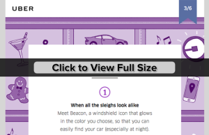
PURPLE
When used in moderation, the colour purple lends prestige to emails and differentiates them from the competition. Purple evokes luxury, refinement and royalty, especially when combined with yellow. Be careful not to use it too much: purple, especially in its darker shades, can cause frustration and melancholy.
In this email from Uber, there is a simple but effective approach, with purple as the main colour and text calling for action.
WHITE
As it’s not a dominant colour, it is combined with other brighter colours in emails to evoke a call-to-action. The colour itself recalls simplicity and purity, but if used excessively it makes the email look dull and cold.
This Win-back email picks up on the colour of the shoes – a clean, optical white – accompanied by a soft green that goes perfectly with the style of the email.

BLACK
In email marketing as well, black represents elegance, sophistication and exclusivity. It is advisable to combine it with brighter colours in order to avoid negative emotions for readers.
In the following email, black has a double meaning: that of Black Friday, of course, but above all of the elegance of the suit pictured.
Check my previous posts here:
- Psychology of colours in marketing: how much do they influence customers?
- Brands that got the colour right
- How to make your logo catchy using the right colours