Finding a more iconic and recognisable logo than Google’s must be difficult! It is therefore not surprising to know that the company did not choose the colours of the logo by accident.
Watch my video to know more about the meaning of colours in Google’s logo or read the post!
https://www.youtube.com/watch?v=HMAgyiHmO1g
Since its invention in 1998 by Stanford University students Larry Page and Sergey Brin, the logo has evolved into the icon it is today. The first logo from 1998 inspired the following ones using the 3 primary colours – blue, red and yellow – plus a secondary one, green.
The founders then asked Ruth Kedar, an assistant professor at Stanford, to improve the logo design. She wanted to make sure that Google was not portrayed as just another company, but as one that defies convention and is not afraid to break the rules. That’s why she changed the order of the primary colours in the letters and coloured the L with green, a secondary colour.
In marketing, colour is used to convey a message and to stimulate specific emotions in consumers.
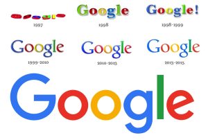
In 2015, Google revised the logo and implemented some improvements. The font Product Sans was used and the new logo, with the famous 4 colours, made the company look more youthful, cool and fresh.
The multicoloured G was created as an alternative for the company and it’s now used in Google products such as cups and services such as Google Pay.
But let’s go back to the main colours that Google uses: blue, red, yellow and green. Surely a company like Google has not chosen the colours of its brand at random. The colour scheme is original and eye-catching. As already mentioned, Ruth Kedar said the idea was to have 3 primary colours and a secondary one for the L to emphasise the fact that the company did not follow the rules. The idea was to have a logo that followed a recognised pattern and that was at the same time innovative and unconventional. This design conveyed an important message, concerning not only the logo itself but the entire company.
Let’s take a look at the meaning of each colour in the logo:
BLUE
It represents the most ‘formal’ part of Google and therefore trust, reliability and security. It is no coincidence that blue is used by many companies in different fields to win customers’ trust.
RED
It symbolises passion, excitement, urgency and thus represents the most attractive and powerful part of the company. Red catches the user’s attention and makes the brand unique and recognisable.
YELLOW
It represents the creative and happy side of Google, as a warm and bright colour. The feelings that yellow evokes are therefore of cheerfulness and energy.
GREEN
The colour of nature and health par excellence, green for Google communicates harmony and growth. It is often used by eco-friendly and ‘green’ companies, of course!
It is thought that behind the choice of these 4 colours there is the combination of paint and light. In fact, blue, red and yellow are the primary colours in painting, while blue, red and green are the primary colours of light. Therefore, the combination of the two creates a harmonious result.
It may also be that the order does not result from this combination but for purely aesthetic reasons.
Another very plausible theory is that the four colours – blue, red, yellow and green – were used for the so-called ‘prime positions’, i.e. for the letters that have the position of the prime numbers 1,2,3 and 5. On the other hand, the letters 4 and 6 (composite numbers) have colours that have already been given: blue and red.
Furthermore, the colours of the logo pay homage to Google’s first server, which was built with Lego in blue, red, yellow and green.
Google’s logo is among the most popular and eye-catching in the world. Google is the perfect example of how sometimes the secret of a logo’s success lies in its simplicity and authenticity.
Check my previous posts here:
- Psychology of colours in marketing: how much do they influence customers?
- Brands that got the colour right
- How to make your logo catchy using the right colours
- Colour psychology in Email marketing
- How to create a colourful newsletter in only 5 minutes!
- Colour psychology in websites
- Cultural association of colours in marketing
