Do you ever look at the newsletters you receive by email and think: wow, what creative mind could have designed this email?
In this post and in the following video, I will show you how to create an eye-catching email with the right use of colour and very few elements, by using canva.com.
All you need is a technological tool and a Wi-fi network!
You can find the video tutorial here:
https://www.youtube.com/watch?v=N2HnC9yvqI0
Step 1: Create the template
Go to canva.com and click on “Create a design” and then on “Newsletter”.
Step 2: Title and text
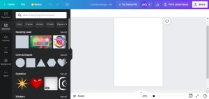
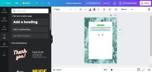
You can put all the information in a shape like a rectangle. To do that, you can click on “Elements” and then on “Lines & Shapes”. To change the background, go to “Background” and type what you’re looking for or choose between the options that Canva offers you. Click on “Text” and then on “Add a heading” to create your title. If you want to put some effects to your title, including the background, click on “Effects” on top. By clicking on “Text” you can add the text to your email.
The colours should always represent the brand or the purpose of the email itself. In this case, the email I comes from a company that produces natural facial oils and wants to inform its clients about a discount. Green in its lightest and most relaxing shades is used to remind customers of the natural origin of the products and to refer to health, in this case of the skin.
Step 3: Images and videos
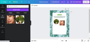
On the left side of the screen there is the “Uploads” option: click on it to upload an image you want to show or find some alternatives by clicking on “More” and then on “Photos”.
Step 4: Put the CTA button
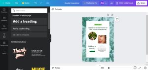
For readers to do what the company wants them to do, it is important that the Call-to-action button is clearly visible, especially through the use of colour. A darker green is great for conveying a sense of trust.
The email is now ready! As you can see, it’s quite simple but impactful and not confusing.
Check my previous posts here:


Thank you for your insights. Your video tutorial was really helpful and interesting. 🙂
Thank you a lot for your comment, I’m glad you found it helpful! 🙂