Visual content plays an important role in the marketing field. As we focus on generating eye-catching user content, the details that makes it all as a whole, are not meant to be forgotten. My previous posts covers what you can create with Canva, as well as videos.
In this post, we will talk about YouTube Channel Art.
What is it?
Otherwise known as a YouTube Banner, this is the first thing any viewers that visits your page will come across.
With a well designed banner, your viewers will be able to instantly identify the type of contention produce, such as a beauty vlog, daily vlog, outfit vlog, the latest tech, you name it.
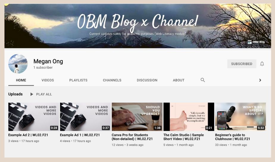
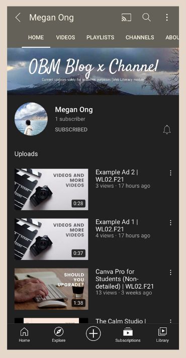
Attached here is a sample of how my YouTube channel looks like on the following versions:
Desktop
Mobile
Does sizing matter?
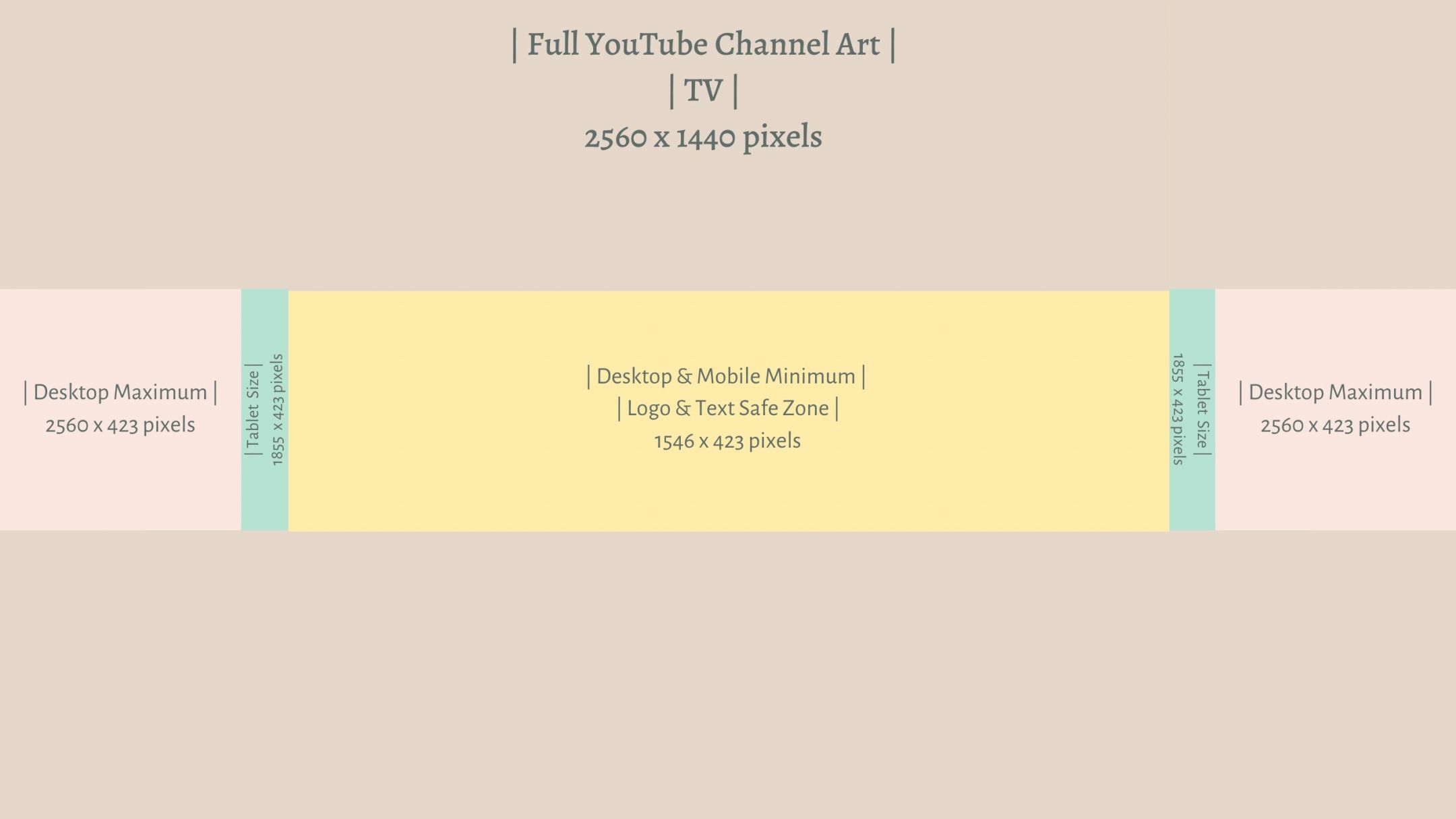
YES. There is a specific sizing when it comes to creating the perfect channel art, as well as where you want to place your text & logo. The channel appears differently on different type of devices, so it is crucial to test on each device.
Creating an attractive banner is as easy as 1,2,3.
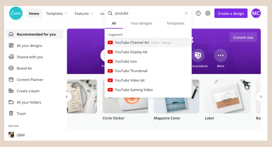
Canva provides free templates for such feature.
The sizing from the YouTube Banner/Channel Art is provided naturally, the only thing you have to do after creating your banner, is to make sure your main information is on the text & logo safe area.
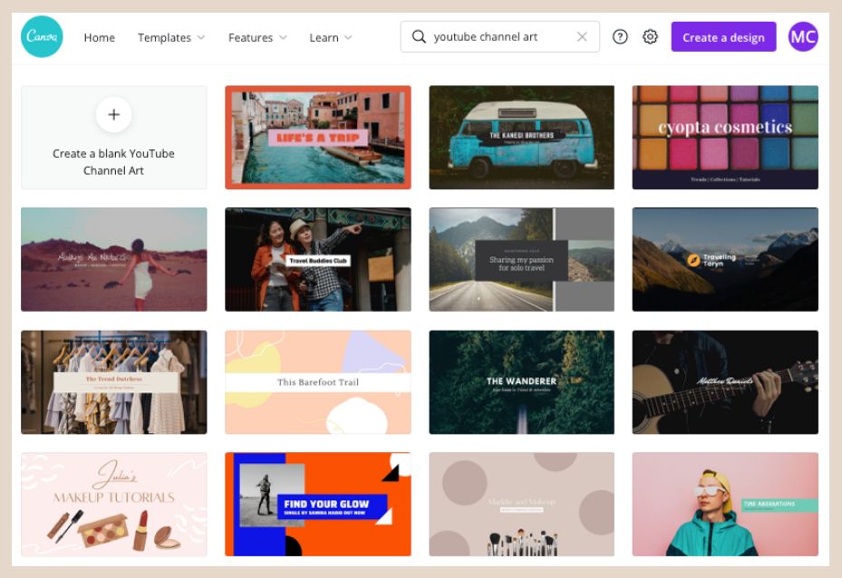
The above are some provided templates on creating a channel art.
I hope you will find this short and simple post useful.
✨ Stay tuned for my upcoming and final post! ✨
Next Post
Previous Posts
? Will Millenials and Gen Z embrace this?
? The invite-only app everyone’s talking about
? Canva – The key to unlocking your designer needs.


Very useful information! I had not even thought of customizing my YouTube channel. Thanks Megan!
It definitely changes the first impression of your potential subscribers!