Today’s introduction is slightly different from the other 2 blog posts I had written previously. If you haven’t seen it, check it out from my bio page!
Out of the blue, I created this riddle. Can you make a guess?
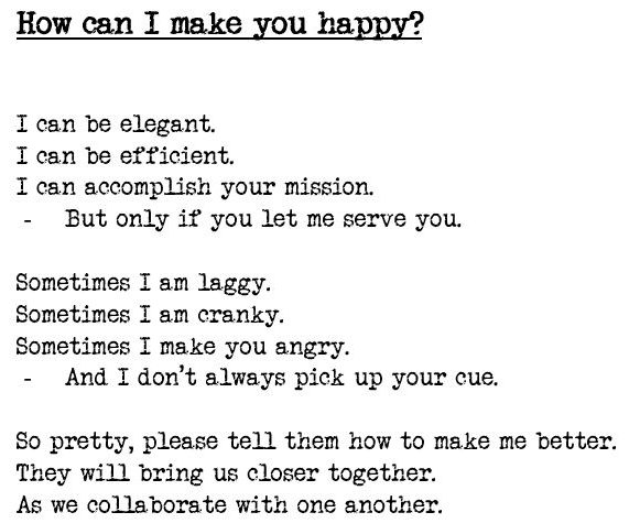
Have you guessed it correctly?
Thousands of research studies have been performed on this topic in the past decade and even today. It is none other than Usability in the context of a digital product.
What is Usability?
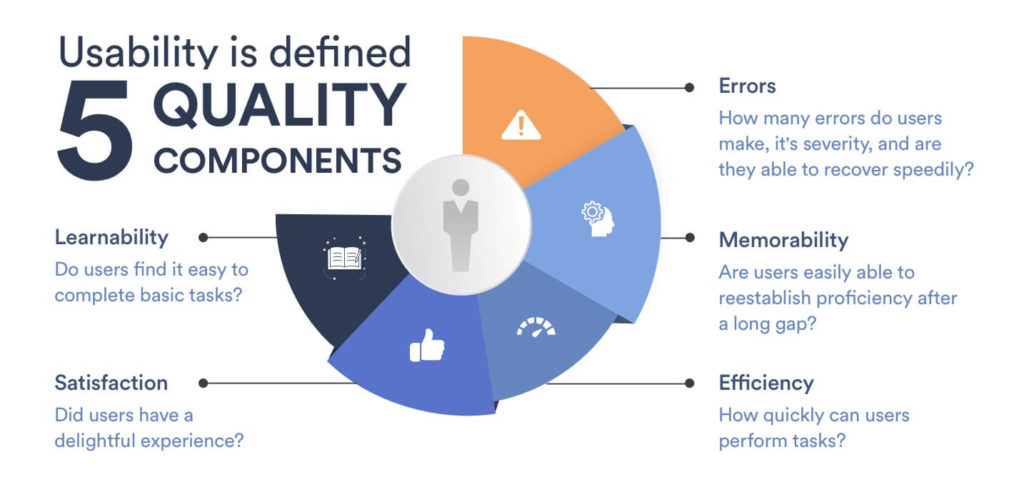
Image source: Mobile Patterns
In the 80s, usability was often referred to as the capability of a product being easily used and was the main concern of product designers. The focus was gradually shifted to a more holistic view to include users’ emotions, behaviours, preferences during and after the interaction. Today, the buzz is all about the User Experience (UX) as a whole. However, usability is still an integral part of it, which is why I would like to quickly introduce a few ways to test and improve usability.
What is usability testing?
Usability testing is a cost-effective qualitative method that determines how easily a user uses the application interface. It can be used to uncover the usability issues faced by the end-user. This process can be conducted with a standard number of participants, testing schedule, and research methods. The analysis of the results allows identification of user pain points and priorities and further improvements of the user experience and design solution.
Let’s look at some examples of usability tests:
1. Heuristic Evaluation
Being considered as part of an iterative design process, the heuristic evaluation is a usability engineering method for examining the usability issues in a user interface design. The reviews of the existing user interface are used to compare against a set of usability principles, such as Jacob Nielson’s 10 general principles of User Interface Design, to develop the results. This model, which is also known as “heuristics”, has been used for product designs by renowned companies such as Microsoft and Apple.
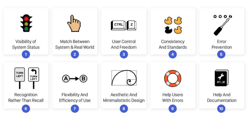
Image source: Medium
2. Cognitive Walkthrough
A method for performing theory-based evaluations of user interface designs, the cognitive walkthrough is based on a theory of usability issues of a system early in the design process. It focuses on the cognitive process where the user performs system tasks in areas where potential failures might happen given little to no formal instruction.
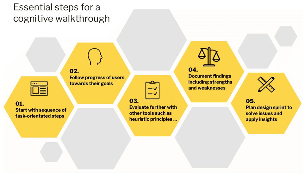
Image Source: Invotra
3. First-click
The first-click test is defined as a fast way to validate wireframes, designs and prototypes of websites, apps, or mobile webpages. It aims to evaluate how user-friendly an interface is for users who are carrying out an assigned task. For instance, a user could be tasked to buy a product from a website. The position of the clicks and the total duration it takes for the user to complete the task is recorded. At the end of the test, the user would be asked to explain the rationale behind their clicks.
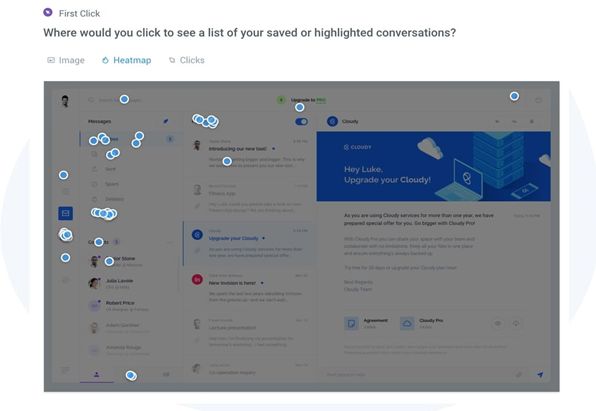
Image Source: Usability Hub
Conclusion
There are different types of usability testing apart from the aforementioned ones. Designers are required to decide on how to use these methods to optimise their products. I hope that this article is useful as a brief introduction to usability testing. If you would like to dive deeper into this topic, you may want to read these:
http://liu.diva-portal.org/smash/get/diva2:421851/FULLTEXT01.pdf
https://www.interaction-design.org/literature/article/how-to-conduct-a-cognitive-walkthrough
https://www.interaction-design.org/literature/topics/usability-testing
http://kau.diva-portal.org/smash/get/diva2:1515094/FULLTEXT01.pdf
http://jultika.oulu.fi/files/nbnfioulu-201511212159.pdf
My other blog posts:
How To Create A Deepfake Video In 3 Mins
Google Stadia In 3 Mins
Gamers Vs Crypto Miners
4 Examples Of Singapore’s Smart Sustainability Efforts
Web 3.0
7 Pros And Cons Of Low-code/No-code
5 Ways Deepfakes Can Impact Your Life



Interesting article! I didn’t get the riddle but I had fun trying! Thanks for the insight and knowledge.
Hahaha, I am glad you had fun trying! 🙂 Thanks for commenting!
Hmm. Interesting topic Nicole. I wonder where did you get this idea ahaha! Well done! Very helpful article 🙂
Hello Bianca. I was inspired by companies looking to improve their digital products. ? Thanks for the comment.
Very interesting! Did not hear about Jacob Nielson’s 10 general principles of User Interface Design before. This is definitely one has to be aware of while developing a website/app.. Thank you!
Hey Sofia, I am happy to share this with you. Thanks for the comment! 🙂
Interesting topic and examples given! Didn’t know usability could be defined as such. Thanks for the insightful write-up 🙂
Hey Stephanie, thanks for commenting. 🙂
Very interesting and in depth article!
Hello Tanja, thanks for dropping by! 🙂
Hey Nicole! Another exciting and quite detailed article from you. Many thanks for this brief introduction to usability testing. I love it! Now, looking forward to your next post!
Hello, thanks for commenting. I will keep you posted. 🙂
I like the riddle Nicole, it is very creative. I knew usability is very important but I didn’t know how companies were testing it. Useful article, thank you!
Hey Demet, thanks for commenting. I am glad that this article is helpful 🙂
Very interesting topic. Good introduction into usability testing and the 3 examples of usability testing were helpful to understand the concepts.
Looking forward to the other posts by you!
Hello Steve, thanks for the encouraging comment! I will keep you posted! Btw, nice blog! 🙂
This is so insightful and gives a different spin on UX.. interesting throwback to the SAP qualtrics products that we dabbled in
Hello, Mervyn. Thanks for commenting! I will keep you posted on my next post. 🙂