Colour is the core of all marketing materials you create in your brand. Starting from the post on social media, company presentation, website, logotype, it is crucial to understand how to find the colour that will look consistent and be in harmony with all parts of your brand visual identity.
Top 6 Tips for selecting the right colours
- Utilise the colour wheel as a foundation for the proper colour selection
- Approach your design project with a colour scheme that favours harmony
- Focus on the context and emotions as the heart of the colour selection process
- Take advantage to employ contrast to improve the legibility of elements on the page
- Apply shades and tints of colour to build flexibility
- Avoid combinations that can generate issues for users
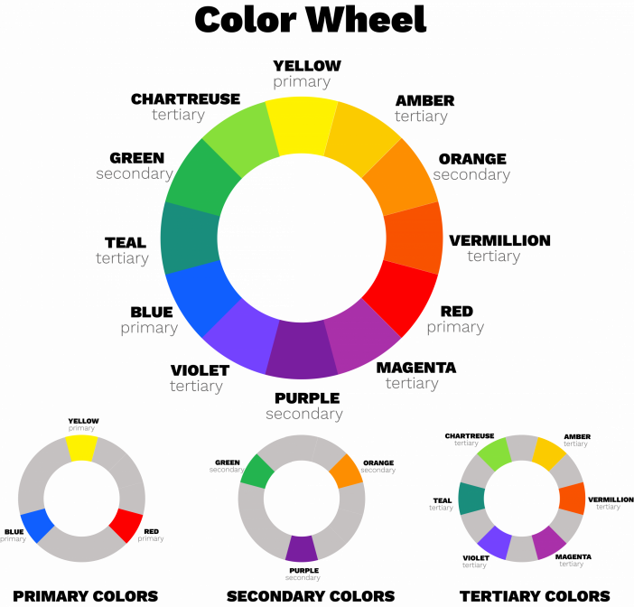
The Color Wheel: primary, secondary and tertiary colours
Remember: the colour wheel is vital in deciding which colours pair well together.
Primary Colours: colours comprised of red, blue and yellow.
Secondary Colours: colours are created by mixing two primary colours, forming green, orange and purple.
Tertiary Colours: colours are formed when mixing a secondary and primary. In other words, it is the colours that we can describe with the two-word name:
- Red-orange (Vermillion)
- Yellow-orange (Amber)
- Yellow-green (Chartreuse)
- Blue-green (Teal)
- Blue-purple (Violet)
- Red-purple (Magenta)
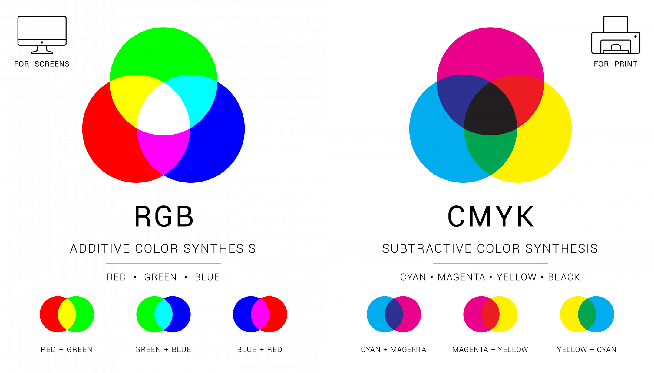
Additive & Subtractive Colour Theory
If you’ve ever experimented with colour in a computer program, you’ve probably come across a module that described RGB or CMYK colours with numbers next to the characters.
Have you ever thought about what those letters mean?
Colour Palette
The Colour palette is the result of matching two or more colours together. Before you start to use the colour wheel, you should be aware that there are four different colour palettes to consider:
- Monochromatic
- Complementary
- Analogous
- Triadic
Monochromatic.
The most simple colour scheme possible employs a single colour with different shades and tints to build a monochromatic palette. The scheme’s colours are all derived from the base colour. While all design elements can feel alike, using high contrast may help break up the monotony. When added to your projects, these monochromatic colour schemes help to create an ordered appearance. A single colour can provide an instant sense of harmony.
Example:
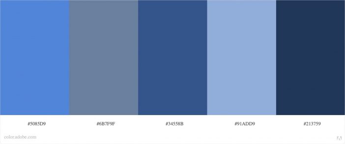
Source: Adobe Color
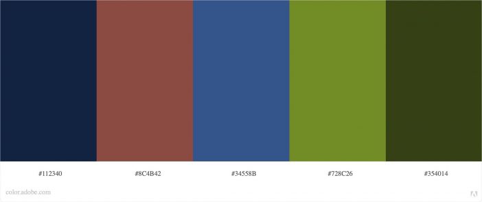
Complementary.
A complementary colour scheme employs colours that are opposite each other on the colour wheel. For example, if you choose blue as your primary colour, it will establish the most remarkable contrast and intensity with orange.
Example:
Source: Adobe Color
Analogous.
Analogous colour schemes combine three or more colours that are adjacent on the colour wheel. In most cases, one primary colour (or hue) is paired with a second to help and a third to accent the colour palette. Colour schemes that are similar build a visually appealing and soothing appearance.
Example:
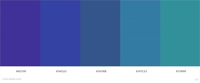
Source: Adobe Color
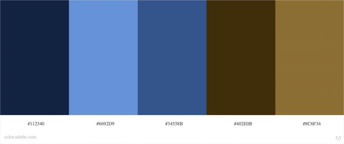
Triadic.
Triadic colour schemes, including complementary colour schemes, add extra pops of colour while allowing you to use a broader colour palette. Triadic colours are the three colours that are equidistant on the colour wheel from one another.
Example:
Source: Adobe Color
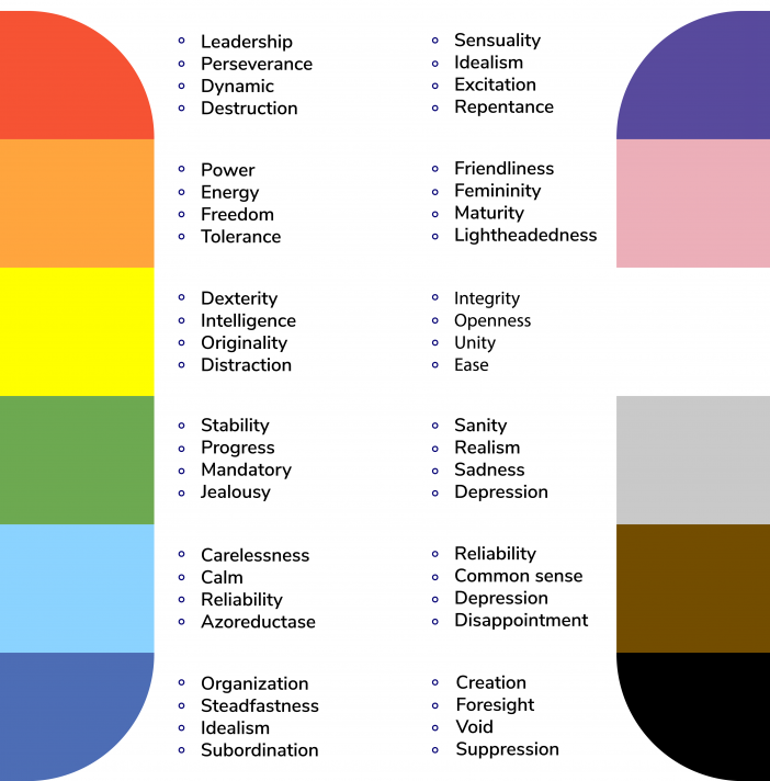
Colour Psychology
Colour psychology can influence how people interpret a design and relate to the colours used because each colour has a different context and purpose. Choosing the right colours will aid in the nonverbal communication of a product’s meaning and emotion.
By the way, professionals from the Chamber of Commerce prepared an extremely valuable guide to colour psychology in marketing.
Learn more: https://www.chamberofcommerce.org/guide-to-color-psychology-marketing/
Colour trends
Pantone Colour of the Year 2021
PANTONE 17-5104 Ultimate Gray + PANTONE 13-0647 Illuminating
A marriage of color conveying a message of strength and hopefulness that is both enduring and uplifting.
https://youtu.be/UOtJuBSphRI
Learn more about Pantone colour of the year 2021
Colour Tools
Adobe Color: Discover Colour Wheel & Trends
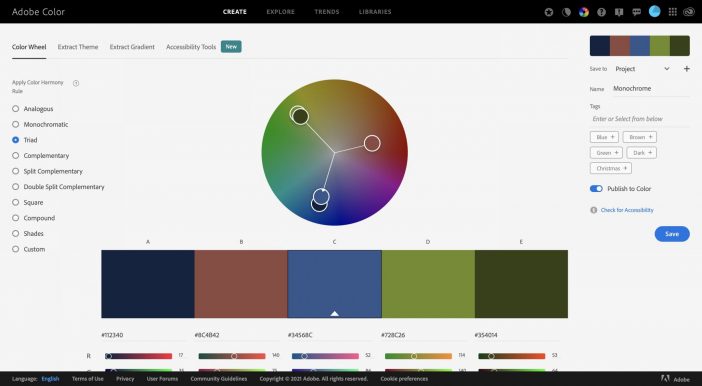
Source: Adobe Color
Pantone Connect: Discover & Create Colour Palettes
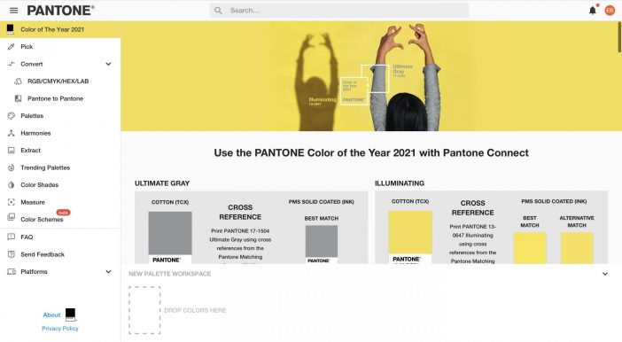
Source: Pantone
Khroma: learn which colors you like and create limitless palettes based on AI
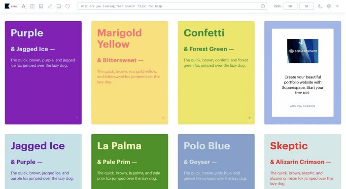
Source: Khroma
Learning & Practice Materials:
CodeAcademy: Course “Learn Colour Design”
W3schools: Colors Tutorial
BrandColors: the biggest collection of official brand color codes
Khroma: learn which colors you like and creates limitless palettes based on AI
Article Sources:
CodeAcademy: Course “Learn Colour Design”


Thank you Ekaterina for this useful post. I will use your tips for sure!
Dear Elena,
Thank you very much and I am pleased that you like the useful side of this post.
Kind regards,
Ekaterina Barras
This is such a detailed overview! Thank you for providing so many useful links, I have saved some of them!
Dear Sophia!
Thank you very much for your feedback! Let me know if you are interested in some topics that I can tailor my content to your needs!
Best regards,
Ekaterina
I added this page to my bookmarks for future reference. I love colors, and one of my fav websites is a color palette generator: https://coolors.co/ Thanks for sharing!
Dear Demet,
Thanks for the feedback and for sharing another colour generator. I have tried it just now, and it is fantastic: fast and adjustable for people with colour blindness!
Best regards,
Ekaterina Barras