Visual elements are crucial for the first impression of a brand.
“People feel your brand before they understand it.”
Before people fully understand your brand, they sense it — through colors, shapes, and typography.
With my brand ayoa, once the name and positioning were clear, it was time to create a visual identity. If you missed the earlier blogposts, I recommend checking them out — they’re linked below. There, I explain the full process behind the brand ayoa.
-
Color
Colors play a huge role in branding. They transport emotions, influence moods, and can significantly change how a brand is perceived.
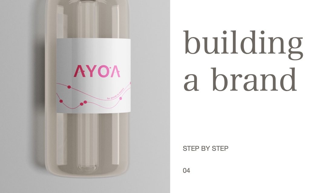
👉 How I did it with ayoa:
For Ayoa, it was important to me to create a modern and youthful vibe.
That’s why I chose bold colors combined with a clean, minimalistic design.
At first, I worked a lot with a vibrant shade of pink — it felt fresh, dynamic, and modern.
Later on, I switched to a blue tone because I felt it aligned better with the water theme.
I also thought ahead: if the brand would expand in the future — for example into vitamin water products — the pink could be the perfect color for a special or limited edition.
Colors can massively change the way a logo feels.
The same logo design can look luxurious, playful, or grounded depending on the color palette you choose. That’s why I recommend taking your time and experimenting with different color combinations.
💡Good to know:
Colors also have a psychological impact:
- Purple often stands for luxury and royalty.
- Red is used to express passion or energy.
- Blue often represents trust and freshness
-
Typography
Typography is another powerful branding tool.
The right font can give a brand character — whether that’s elegant, modern, friendly, or serious.
👉 How I did it with ayoa:
For the Ayoa logo, I wanted to use a clear and simple sans-serif font.
The goal was to keep the design clean and timeless.
To add a personal touch, I integrated a few graphic elements into the lettering: Dots to represent the bubbling of water and Wavy lines to symbolize both water and a sense of flow and lightness.
These graphic elements are present throughout the entire logo.
They don’t just represent water — they also reflect the community idea that I explained in more detail in my second blogpost: In ayoa, community plays a central role. It’s about people coming together, sharing a healthy and active lifestyle.
The dots along the wave lines symbolize individuals who are moving along the same path and connecting through a shared journey.
If you’d like to see my full logo design process, you can watch the video here:
I created my logo using Adobe Illustrator, as I already had some experience with it from my studies. Of course, there are great alternatives as well, like:
- Canva (perfect for beginners)
- Figma
You don’t necessarily need expensive software to create a strong logo!
Tips for Designing Your Logo
- Be timeless:
Try to design a logo that won’t go out of style with short-lived trends.
Trends come and go — but a timeless logo stays. - Less is more:
Often, simple and clear logos have a stronger impact than ones that are overloaded with details. Simple doesn’t mean boring! - Get a second opinion:
Feedback from others can be incredibly valuable during the creative process.
A second (or third) opinion can help you spot things you might not see yourself. - Focus on your target group:
Always keep your target audience in mind when designing your logo.
Your logo should speak to them — not just to your personal preferences.
I hope this gave you some insight into how important visual elements are when building a brand — and maybe it even inspired you to start working on your own logo. Thanks for following along with the ayoa journey — I’m excited to see what amazing ideas you’ll bring to life!