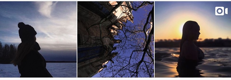
At the moment, almost any self-respecting commercial project has a person who will create a content plan for social networks. But one thing is good text and picture, and another thing is whether the posts will look good with each other.
There are only a few criteria for maintaining a visually beautiful feed on Instagram:
1. profile layout
2. light and color
3. presets and filters
4. edit of pictures
Reading this blog you have already learned about the main moments of shooting and processing photos on your smartphone. But today we’re going to talk about feed light.
In the case of light, the feed can be dark and light.
It is up to you to decide which side to go to.
Everything depends on several factors:
1. from personal preferences – from the fact that you like it better visually.
2. from what works best – if you are shooting on an iPhone, the likelihood that you will have a light profile increases. Because the quality when you shoot on the phone in the evening is deteriorating.
3. from what you have – initially, you will create the tape from what you have. So if darker pictures prevail – you have to try working with darker pictures or go and shoot again) if you start blogging, you will soon learn how to shoot almost every day.
Next, you will see a lot of examples. I recommend that you repeat everything you have learned in the scheduler applications (like UNUM, Inpreview, Content Office, Preview, UCROP, Snug, Planoly).
Light feed Dark feed Mixed feed
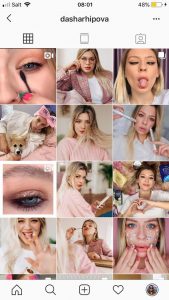
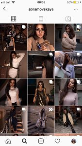
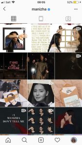
In my opinion, a light feed is easier to create than a dark one. Basically, we take all the photos under natural light. Instagram profiles with lighter visuals look brighter, more positive. Filters and presets are easier to apply to light photos.
And as statistics show, blogs with light visuals are more attractive, it can be easily checked by going to the profiles of almost any large bloggers.
I’m not talking about the light vision being better. Blogs with dark visuals can look incredibly beautiful, but you really need to be able to lead them, train your eye. Dark blogs look more brutal and saturated (with a skillful visualization).
It is very difficult to lead a beautiful dark profile, so I would advise beginners to take a closer look at the lighter shades.
Use your old photos of any time period. In order to assimilate the information, you need to use it. The main rule in making any tape is a constant practice. Roughly speaking, here everything is decided by experience, heritage.
Thank you for being here with me!
If you have any questions, don’t hesitate and text me on social media!
See you soon!
