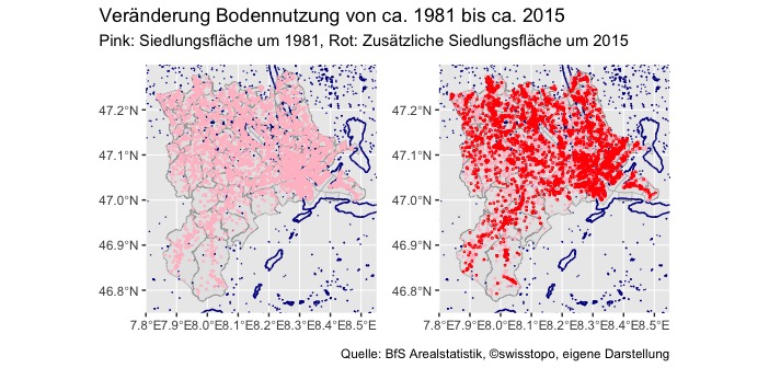
Imagine you want to analyze the information concerning land use. More precise you want to know how the land usage changed in the last few decades in your area. Thanks to the Federal Statistical Office that is not a problem at all. They provide a data set (Arealstatistik: Nomenklatur 2004) that gives you information regarding the land use of essentially every hectare in Switzerland. Hence, you can rather easily calculate that the residential area increased since the beginning of 1980 until today increased in the canton of Lucerne by about 60%.
With this hurdle cleared, the natural question to ask is whether there is an easy way to visualize this increase in land usage for residential purposes?
Well, no problem, you can code R, right?
No, not really!
OK, you can just rely on new technologies (i.e. ChatGTP) to pave a smooth way for your R code?
No, that is not my cup of tea!
OK, so I suppose you can still do it the old-fashioned way and learn R code using blood sweet and tears…
Well, yes, that sounds like fun.
It is even rather straightforward if you follow a few steps. Hereafter is a simple self-help guide to visualize Big Data on Big Areas if you do not have any knowledge in R.
1 You are not the first person to encounter the problem
That is encouraging. If you search for “visualize geospatial data in R” google finds around 6’360’000 results. I really enjoy the examples that start with an easy structure (e.g. basic map) and based on it add further layers (e.g. different colors). I am aware that this first step is neither a revolutionary idea nor particularly sophisticated. However, it broadens your horizon as you learn new terms and concepts such as “shape files” or whether to install the package “ggmap” or “ggplot2” to solve the task.
2 No, you are not the first person to encounter the problem, but your problem is nevertheless unique
That is somewhat less encouraging. The main challenge in this instance is that you cannot interpret the code properly. So as soon as you have some differences to the code snippets in the examples you can easily get stuck. So how did I overcome this hurdle? I took a few beginners courses in R. I found the tutorials on datacamp very useful, but I assume any course that provides basic knowledge and concepts of R will do the work. With the newly acquired knowledge the literarily millions of examples make a lot more sense and you get a much better understanding which examples you can tweak such that they work for your unique problem.
3 Keep it simple
The learning curve is steep. That is good but you can also be inclined to do too much. In my case I packed all information on the map. When I showed the results to friends, they found the map great (a lot of colors) but somehow the message was not clear at all (a lot of colors). The solution is to keep it simple: What is the main message and which information is necessary to communicate this message.
I wanted to show how land usage for residential area increased over time. Therefore, I only used data regarding residential area and omitted other data (e.g. agricultural usage). Further, to emphasis the transformation over time I decided to use colors. The pink points represent residential area in the beginning of 1980. The red points represent residential area that have since then been developed. The result is a simple but striking map.