organized by Tobias Mérinat und Halldór Janetzko
Overview
However, with some background knowledge on information visualization and a set of guidelines, principles and rules, the task can turn from being difficult and dreadful to interesting and fun.
You will get the theoretical background on what makes up good visualizations, see lots of examples, both of the good and the bad kind, and build our own interactive visualizations of real-world data with the Processing language.
If you always struggle a bit with visually presenting your findings in a meaningful way, highlighting the important parts and leaving out the rest, then this workshop is for you.
Outcome
Participants will know what makes up a good visualization and which visualization methods suits which data type. They will have built their own interactive visualizations with Processing and have gotten a glimpse into the world of visualization with Python.
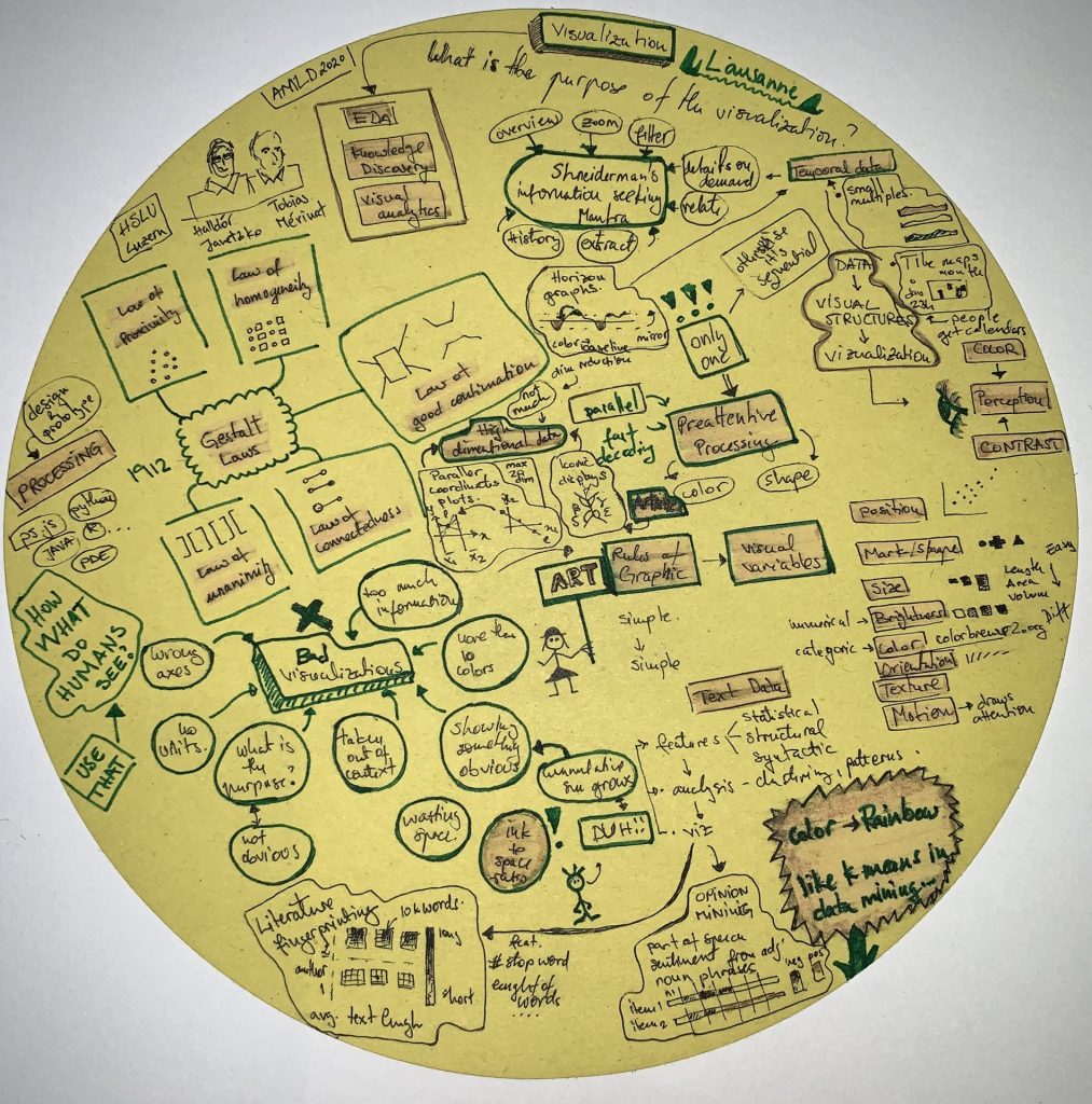
Summary visualization courtesy of participant Tereza Iofciu