Studio Game 2 | Mattia | Week 7
UI and materials
This week, I created a UI, implemented it and also created custom materials and shaders for the game.
I also made some overall improvements to the project, so it runs pretty smooth in real time. I managed to have a „playable version“ of the project at the end of this week!
User interface
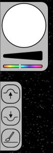
 I never really created a game UI on my own before, so I didn’t really know how to go about it. But, I just started making a mock-up in Illustrator. Once I somewhat liked it, I exported each UI-Element and implemented them in Unity.
As I imagined, implementing the UI was much easier than designing it. So yeah, it doesn’t look grate, but it does work, and good enough for now.
Materials and Shaders
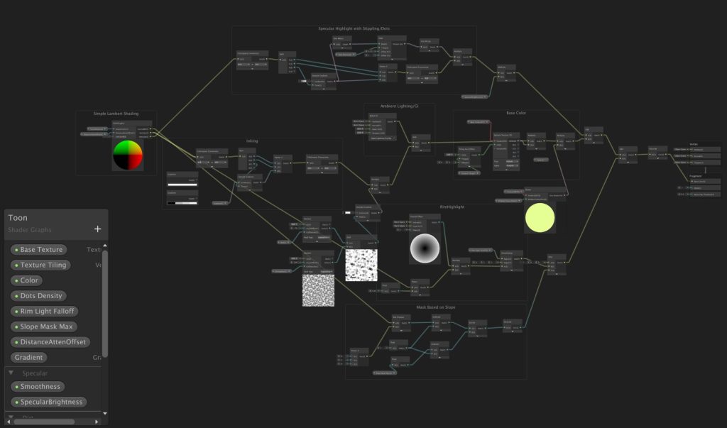
The material-shader I made for the planet surface is based on the shader I made last semester in StuGa1. It’s a toon shader, that works with multiple lights. The main color for each pixel gets sampled from the 3D textures G-value. This is a value between 0 and 100. The value represents the HUE of the color. Then, after that, the amount of light on the pixel gets calculated, sampled through a fixed gradient, and then added to the main color. That’s how the toon-look is done.

The second main feature to the looks is the outline shader. This is a fullscreen-shader. Fullscreen shaders are a relatively new feature introduced in URP 14.
Fullscreen-shaders basically work like a post-processing effect. You can read in the current frame with some extra information for each pixel. For the outlines, I only need the color, and the normal of the vertex the pixel represents. Then, for each pixel, I compare the difference in normals and colors with its neighbouring pixels. If a certain threshold is reached, the pixel becomes black (the color of the outline).
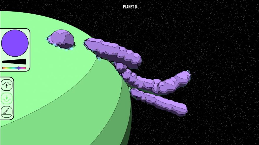
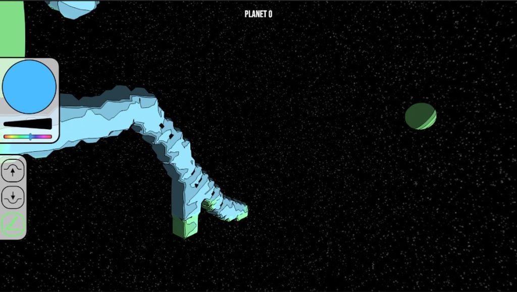
Here are some screenshots of sessions where I just played around in the game.

