by
by 
Carl Parrott, a Master Design student working on the experience of the master diploma exhibition, asks this smart question. Here are four tips that I shared with him that you could also apply in your own Service Design practice:
- Make the Emotion and Problem Clear: everybody understands a strong emotion, especially if it comes in the form of a testimonial based on real research.
- Start with What’s Tangible: show something like a physical prototype, a website, a brochure or a shitty prototype.
- Show the Impact: with numbers or testimonials show the before and after and the impact on people’s lives.
- Don’t Start with Complex Mappings: or at least don’t start right away with your fancy Service Blueprint that the layperson won’t understand in 30 seconds.
A big thank you to Carl Parrott for inspiring these valuable insights, and to all the design students dedicated to mastering the craft of service design.
The summary
This summary was written with the help of Descript’s AI and the transcript of the video. I reviewed it and shortened it for clarity.
The problem
In the world of design, showcasing service design work can be quite a challenge. Unlike tangible products, services are often intangible and require a different approach to effectively communicate their value and impact.
Tip 1: Make the Emotion and Problem Clear
The first tip emphasized the importance of making the emotion and problem behind the service very clear. By highlighting testimonials that showcase the pain points the service aims to solve, designers can establish a strong emotional connection with the audience. Using audio or video testimonials can further enhance the impact, while role-playing scenarios can make the experience more engaging and relatable.
Tip 2: Start with What’s Tangible
Building on the intangible nature of service design, the second tip suggested starting with elements that are tangible. Whether it’s a website, a brochure, or a prototype, tangible artifacts can help bridge the gap between the abstract nature of services and the audience’s understanding.
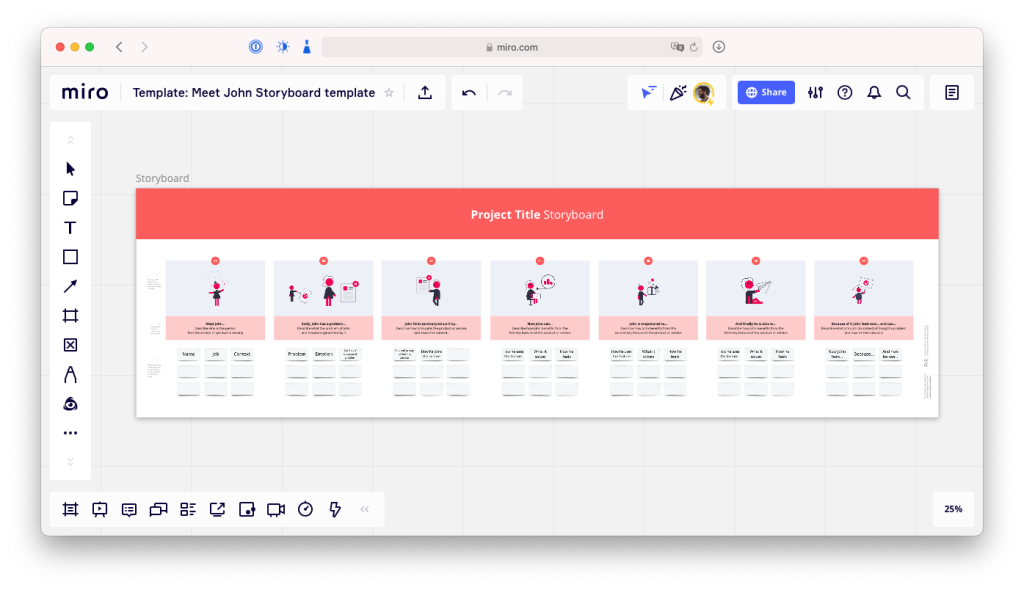
Animated storyboards, like the Meet John Structure, offer a creative way to tell a story that resonates with the audience on a personal level.
Tip 3: Show the Impact
The third tip focused on showcasing the impact of the service design work. By presenting before-and-after stories or using simple numbers to highlight the positive changes brought about by the service, designers can make the impact more tangible and compelling.
Tip 4: Avoid Complex Mappings
Lastly, the fourth tip advised against starting with complex mappings and blueprints. While these tools are valuable for detailing the intricacies of service design work, they can overwhelm and confuse general audiences. Instead, designers are encouraged to use these visuals as supplementary information for those who want to delve deeper into the project.
How to apply that on a website?
In Carl’s project to showcase service design work on a website alongside an exhibition, using videos can convey the research, pain points, and emotional context behind the service.
Transcript
Show the transcript
This transcript was fully generated using Descript. The transcript wasn’t corrected. Which means it can be pretty creative, funny or wrong at moments.
How can you showcase service design work on an exhibition or on a website for the masses?
This is another very smart question from a master design student called Carl Parrott.
Service design is often like hell to present to people who are not service designers themselves.
Why? Because usually it’s all intangible. Services are this intangible bit. When you have to present some product design work, you have a chair, you have something physical that people can see, look around, and even touch.
But with services, we’re speaking about processes, customer journeys, blueprints, and all of this is intangible and pretty fuzzy for most people.
So when Carl sent me his question for a coaching session through email, I came up with four tips for him. and I believe these four tips can be useful also for any service design practitioner when he has to exhibit his work, be it a student project or a project within an organization.
Tip 1: Make the emotion and problem clear
The first tip is to make the emotion and problem very clear.
Maybe people don’t understand exactly what service design is, but what they all understand is a good problem and a good emotion. Seeing someone pissed or joyful is something that we all relate to.
To do that in an exhibition or a website, you can simply have testimonials that show the pain points that your service is trying to solve.
These testimonials can be very simple as just a line of text, but they can be much richer by being in audio form or video form.
And if you want to be even a bit more theatrical, you can bring in real people to give that emotion back.
If you can’t bring the customer or service user, you can role play that situation for the people watching the exhibition.
Tip 2: Start with what’s thangible
My second tip would be to start with what’s tangible.
Service design works a lot with the intangible, but also has an impact on what’s tangible.
Stuff like a website, a brochure, an employee handbook, or even a shitty prototype made of cardboard. These are all things that people can see, touch, and even smell.
They quickly show how that service can help solve the problem that was shown at first.
One of the ways I like to do that in my own work is to use kind of animated storyboards.
I use a template that I call the Meet John Structure, which basically is a little story where we say stuff like:
Meet John, a lovely carpenter who has a problem with taxes.
And then in that storyboard, I showcase how the service works through the eyes of John. And more importantly,
how John feels at the end. Because what we all want to see is a good story with an emotion at the start which is difficult and a happy ending in the end.
And this brings us to tip number three.
Tip 3: Show the Impact
Show the impact.
We build services to have an impact on the world. So it’s important that we showcase that impact. It can be through stories or with just simple numbers.
So that these impact elements make more sense, we often need to showcase the before and after.
Showing how shitty the situation was before we improved the service or before people had the service. And then showing how the service or the service improvement really changed the lives of people.
Showing the before and the after makes the impact much more tangible. And, just stronger.
For example, if I tell you that immigrants that use a public service are really happy by using it, you will say, good for them. But if I tell you that a few years ago, most immigrants that used a specific service hated it so much, and then I show you how they love it after we came in with the service design work,
you really feel the impact and you see how it changes the emotions,
Because remember, not everybody understands what service design is or what it does, but everybody can read emotions.
Tip 4: Don’t start with the complex mappings
Tip number four: don’t start with those fancy mappings.
Service designers love a good service blueprint, a long customer journey with a lot of details, a big and fancy stakeholder map.
We love them so much because they summarize weeks and months of research into one visual coherent piece of work.
But for the lay person who will spend only 30 seconds looking at it, it feels like a tsunami of lines and circles and arrows with way too many colors and way too much text that they could read in just 30 seconds.
That’s why I’d recommend that you don’t take these blueprints and mappings as the center stage piece of your work, but instead as additional information that people who are really curious or who are interested in service design can then go and look at in and explore more deeply.
Applying those tips to a website
Carl’s project is mainly to showcase the service design project to a website that is a companion to an exhibition. A website is a great place where people could then see the stories and the videos and the audios of the research, where we can see, the pain points, the problems, the emotions.
I strongly believe that a good video is often a very good element to help make service design much more clear, just because we see the emotion on the people’s faces.
Summary
So to summarize it all,
When presenting service design work, just make a good story.
Show a problem and a strong emotion and show how your work changes that emotion and how it fixes the problem.
A big Thank you to Carl Parrott for his question and a big thank you to all Service Design and Design Master’s students of the HSLU.